Hello, my name is Ben Westergreen

I’m an Interaction Designer living in Vancouver BC. For the last few years I worked at Shelfie as an UX/UI Designer. Previously I worked with Vancouver Coastal Health as a Research Assistant through Emily Carr University.

I have been focusing on User Experience, Rapid Prototyping, Illustration and UI design. My design practice is grounded is empathy and relationships. Working as a team to deeply understand the needs of people and truly listening to each other.

Outside of applied design – I practice Visual Art exploring site-specific space, identity, and gender. I’m also an avid audiophile if you want to discuss your favorite micro-genre.

SHELFIE

Shelfie disrupted the publishing industry by allowing readers to digitize their print libraries. Cutting-edge computer vision was used to identify books from images of bookshelves. That data was leveraged to offer recommendations to readers and direct to user marketing for publishers.

MY ROLE

I led design of Shelfie for iOS, Android and Web from Spring 2014 to Spring 2017. During this time Shelfie grew to +100k users and was featured worldwide in iTunes.

I led the product team to evolve the service and address customer pain-points related to library management, digitization, recommendations, discovery and social experience. I developed the identity for brand, app, and communications. I worked with the marketing team on content and strategy.

From fall summer 2016 my role expanded to lead product management for iOS and Android. I guided product roadmap – informed by planning and research of our Mixpanel analytics.

TOOLS

CONCEPT IDEATION

I worked with our founders to create project briefs that supported business goals while addressing readers’ pain points.

USER RESEARCH

I uncovered insights about our users that defined strategy for product cycles. I researched competitors to define our products boundaries and consumer behaviours.

STRATEGY & VISION

I created frameworks, scenarios and sketches to share vision and strategy. I collaborated closely with the engineering team to further ideation and gain alignment.

PROTOTYPE

I executed wireframes, rapid prototypes and interactive animations while realizing design alternatives. I collaborated and prioritized features with developers for iOS and android.

VALIDATION & ANALYTICS

I developed validation testing for product cycles to inform iterations. I ran user testing and studied quantitative analytics to highlight customer pain-points.

LEADERSHIP

I evangelised design thinking across engineering and marketing teams. I managed product roadmaps for iOS and Android while negotiating with stakeholders to prioritize user needs.

THE CHALLENGE

When I joined the team, the app previously called Bitlit allowed users to get an ebook for free or discounted if they already owned the print edition. The problem was accessing content required a publisher to sign up – which had proven to be an uphill battle for the content team. Users were extremely frustrated when a book they wanted to convert was not available on Bitlit. Some publishers were printing communication within new books to create awareness, but this resulted in very low retention – users abandoning the app after one ebook conversion.

THE SHELFIE CAMERA

The Shelfie camera was a groundbreaking approach to digitally identifying a collection of books. It used cutting-edge computer vision to segment book spines, OCR, visual matches and training the data with the assistance of mechanical turks. I was tasked with integrating the feature into the existing app, which used cover recognition to identify books.

The team had established internal language for new concepts and actions which were bleeding into the front end. Combined with the need for photos to be taken at a specific distance, angle and lighting; onboarding had to be broken down to the simplest mental model. After several guerrilla testing sessions we developed two mandates which successfully improved photo submissions.

  • Explicit language: Iconography and branded actions (Add a Shelfie) were outside existing patterns which users did not understand. Actions and buttons in Shelfie need to be focused on the users’ goals: Add a Book, Add a Shelf, Get Ebook.
  • Lead by example: Language based instructions were not engaging users. Onboarding needed to show users how to complete an action only when they need to know, and visualized through photography and illustrations. Animation was used to guide focus to critical ideas.

BOOK IDENTIFICATION

Identifying book spines from images had a processing time ~10-45min. The vision had initially been a black box “magical experience”. This lack of transparency resulted in users giving up, assuming something had broken.

Inspired by Buell and Nortons’ paper The Labor Illusion: How Operational Transparency Increases Perceived Value I worked with our computer vision team to create a user friendly mental model. This allowed for rapid development, using the existing pipeline data to communicate progress and increase perceived product value. Progress was communicated with explicit pipeline progress and live book cover updates.

PROOF OF PURCHASE

Converting print books to ebook and audiobooks on Shelfie required a user to claim their book and validate their ownership. This process was plagued by internal language and an over communication of the work involved before necessary. User testing revealed users weren’t converting on purchases due to an over complicated mental model.

I created journey maps to deconstruct the flow within the framework of our technical and contractual restrictions. I realized understanding ownership validation was irrelevant until after a user expressed purchase intent. The entire information architecture was reworked to allow discovery of available titles and prices by implementing a barcode scanner, search and homogenised book pages.

Book pages were unified into a single material based design that could be displayed from their library, a search result or as a card in the barcode scanner. This opened up the purchase funnel by allowing users to start a purchase anywhere.

SIGNUP CONVERSION

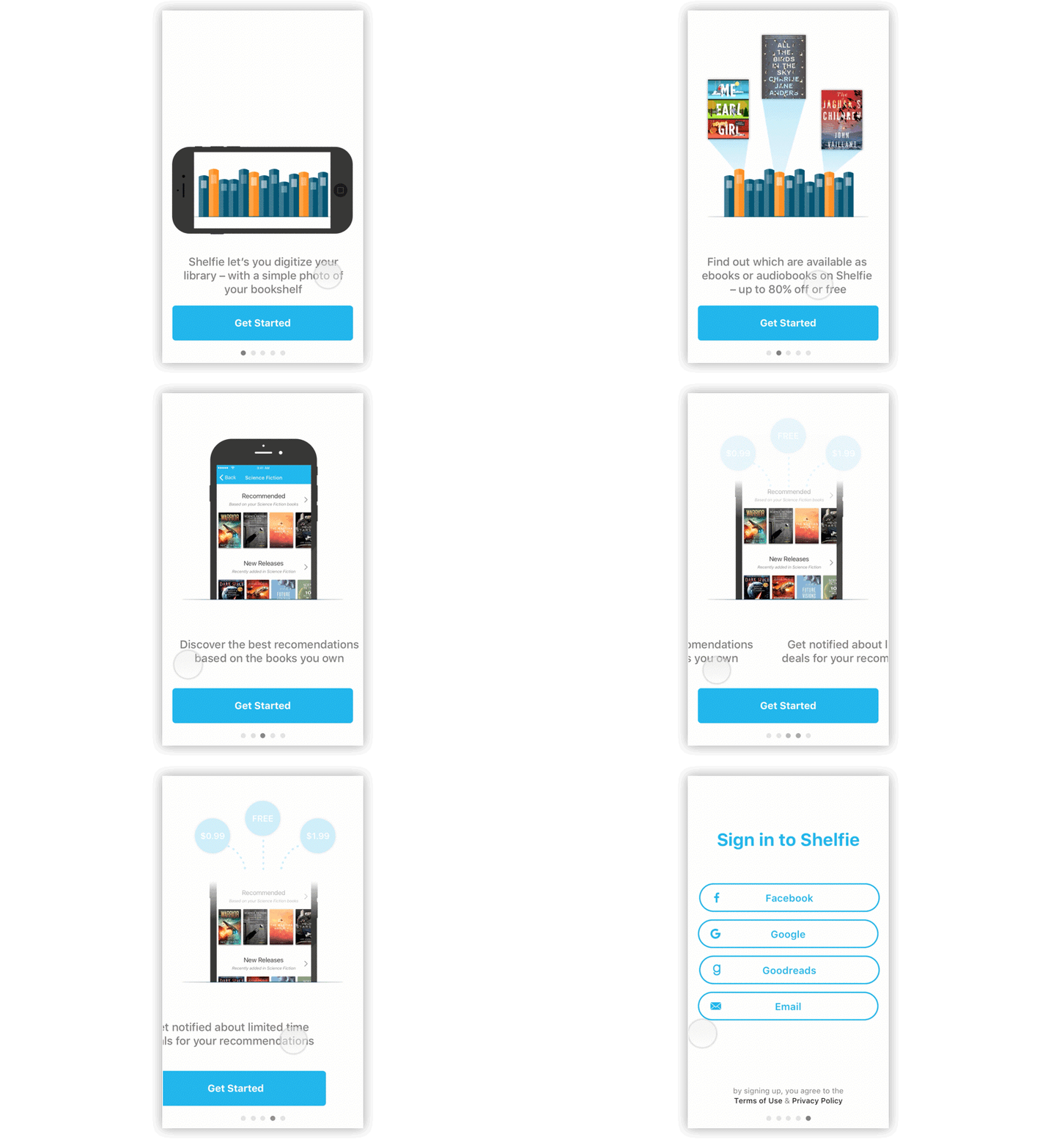
I uncovered a high level of signup churn through our analytics. The previous signup experience lacked an engaging communication of Shelfies’ core values. I hypothesized a simple interactive animated walkthrough would delight and engage users.

I collaborated with front end developers to design an animated experience using paper. This was executed as a high fidelity prototype using Principle for execute buy-in and to communicate design specs. After releasing the new welcome experience there was a significant increase in our signup conversion on iOS and Android.

INTEGRATED RATINGS & REVIEWS

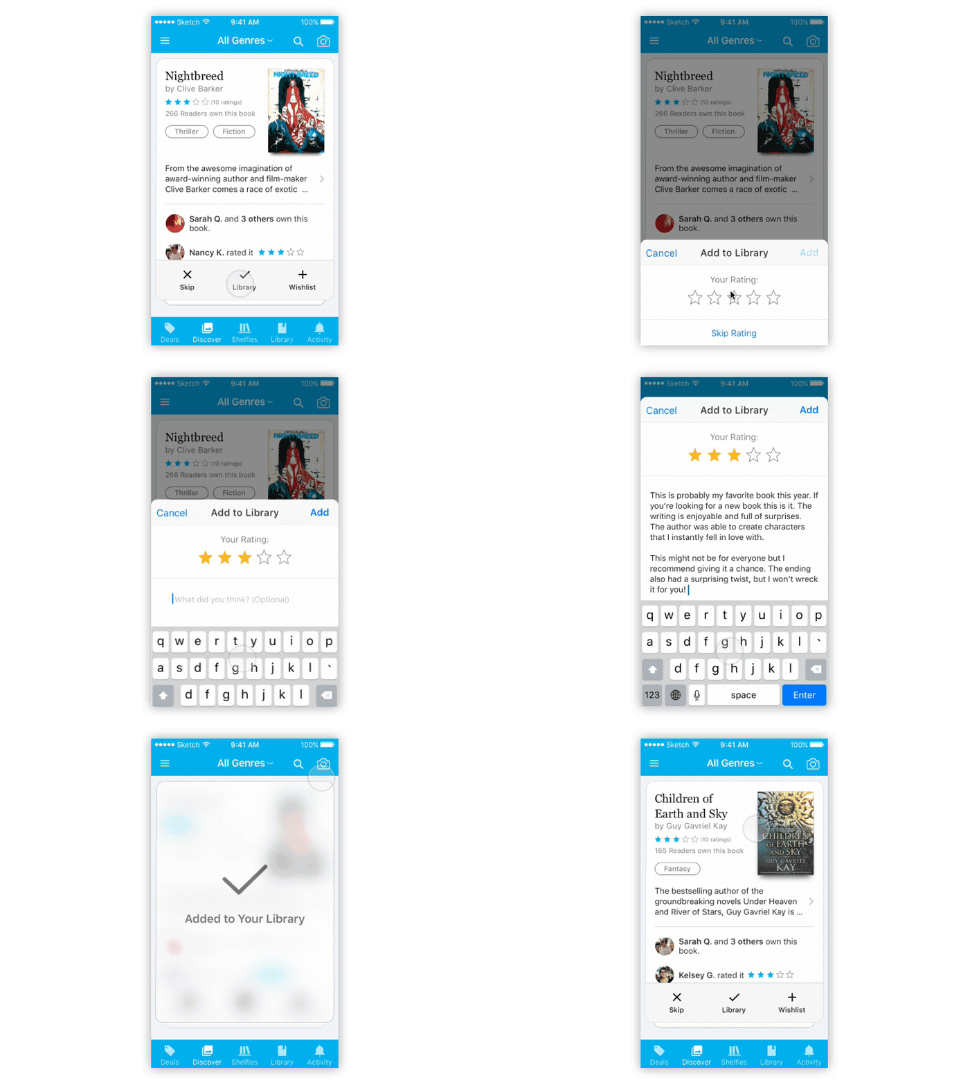
I was designing a Discover Stack that presented recommended books to user. The recommendations would be presented in a stack of cards, containing information about the book, and ratings and reviews prioritized by social connections. The challenge was sourcing ratings and reviews while the app grew. We knew from testing that users would be shown books that had already read within their Discover Stack. We needed a system that would allow users to give feedback about the recommendation system, without complicating their flow.

I executed prototypes to integrate quick ratings and reviews into the Add to Library action, for when a user had already read the book. Once launched, >40% of Add to Library actions also included a rating on the book. This was a huge success for generating user content and allowed more reactive recommendations.

VANCOUVER COASTAL HEALTH

Vancouver Coastal Health administers 13 hospitals more than 500 facilities in British Columbia. Scott Bell, Zoe Hardisty and myself designed a system for front-line staff and management to analyze response times and audit data. Our team was selected by VCH through the Interaction Design program at Emily Carr University.

MY ROLE

We collaborated on discovery to understand treatment of strokes and sepsis infections. We interviewed front-line staff and management to understand their environment and pain points. I created rapid prototypes using Axure RP to validate our hypotheses with staff and gain stakeholder confidence.

THE CHALLENGE

Rapid response times are critical for life threatening strokes and sepsis infections. Data for response times were being collected on paper, but they lacked resources for data entry and analysis. Patient flows required the collaboration of multiple facilities and departments, where a single delay could be life or death.

Data Entry

Through staff interviews and on-site research we concluded that a digital device would automate data entry and replace the neglected paper audits. A context aware digital entry lightened the cognitive load for busy front-line staff. The portable device allowed staff to enter the data where and when they needed.

DATA VISUALIZATION

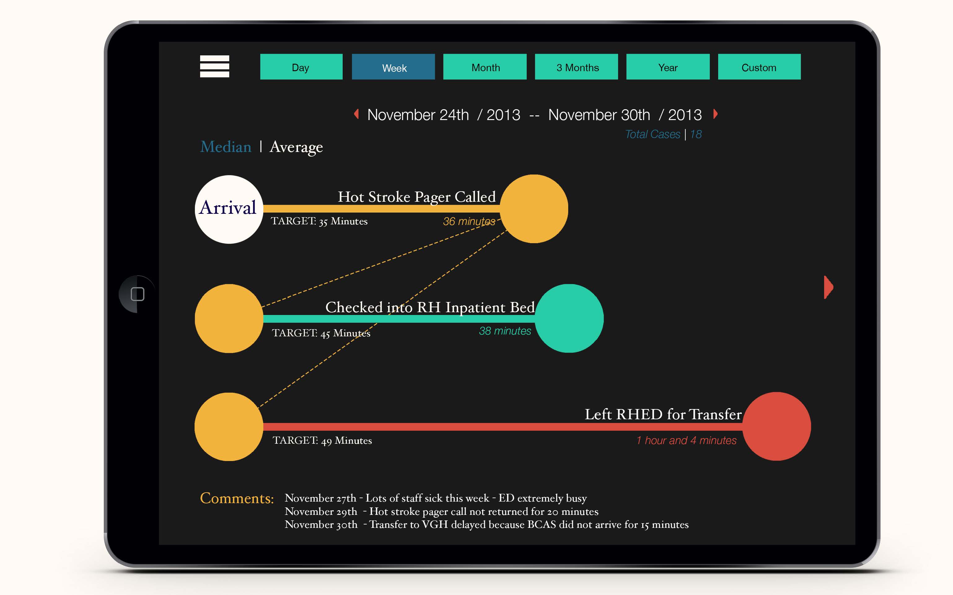
Through iterations and staff collaborations we discovered that performance could be simplified into whether response times were hitting their targets. Staff could quickly analyze response times and understand what needed to be improved without complex analytics. Automatic notes were generated to integrate context – such as staff shortages and extreme weather conditions.

Have a new interesting project?